The Vermont eBird frequency histograms, more popularly known as the eBird bar chart, represent how bird occurrence changes over the course of the year. They are created directly from Vermont eBird data.
You can explore data by state, county, a birding hotspot, a personal ebird location, or even your backyard if there is enough data. You can do this for all years, a range of years, or a single year.
Create a Bar Chart at Vermont eBird
How the Bar Charts are Calculated
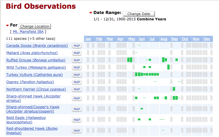
Vermont eBird bar chart for Mt. Mansfield IBA.
Each month is broken down into four periods, each approximately 7 days. Then we calculate the percentage of checklists reporting a species, but only those that report all species. The wider green bars show the periods when a species is least likely to be missed, while the narrower green bars show when species is present (or sometimes present), but infrequently detected.
The bar charts display species frequency (not abundance). Frequency is a measure of the percentage of checklists that record a given species. Observations that do not report all species are excluded and in these cases any such observations are marked only as present (the narrowest green bar).
Frequency calculations are made for each of four periods within a month simply by dividing the number of checklists with a given species by the total number of checklists for that period. When you click the Download Histogram Data at the bottom of any bar chart you can see the exact frequencies that have been calculated as well as the sample sizes for each period.
Since most months do not divide equally into 7-day periods, any remaining days are added to the last period. Thus, while the first, second, and third periods are all seven days, the final period ranges from seven to ten days, depending on if the month has 28, 29, 30, or 31 days. The fact that the final period is consistently longer does not seem to bias the results strongly, but please do keep this in mind as you explore data using this tool.
How to Interpret the Bar Charts
- Gray shading indicates that there is no data for this period. The user should not infer presence or absence of a species, since no data exist for this period. More birders need to visit that location and report their checklists.
- A blank space indicates that the species is unknown during this period. There is data from this period but there are no reports for the species, so we can infer that it does not occur at this season, or at least is so rare that we don’t have any records in Vermont eBird.
- The very narrow green bar indicates that the species was recorded during that period, but that it is extremely rare (on less than 0.3% of checklists) or was reported on a checklist that did not report all species.
- The moderate green bar indicates that the species has been recorded here at a frequency of 1-5%.
- The very thick bars for a species indicate that it occurs at the highest frequency during this period.
Note that you can always find out the sample sizes and the exact frequencies by clicking the Download Histogram Data link at the bottom of any bar chart.
The frequency values were selected to best show bird abundance at various scales.
| Width | Min | Max |
| 9 | 60% | 100% |
| 8 | 40% | < 60% |
| 7 | 30% | < 40% |
| 6 | 20% | < 30% |
| 5 | 10% | < 20% |
| 4 | 5% | < 10% |
| 3 | 1% | < 5% |
| 2 | 0.3% | < 1% |
| 1 | 0 | < 0.3% |
In the above chart, note that the maximum values generally are not included in the range, while the minimum values generally are.These calculations are generally updated each night.
Creating a Line Graph
Your can explore different metrics of species occurrence in a line graph by simply clicking on a species in the bar chart list.
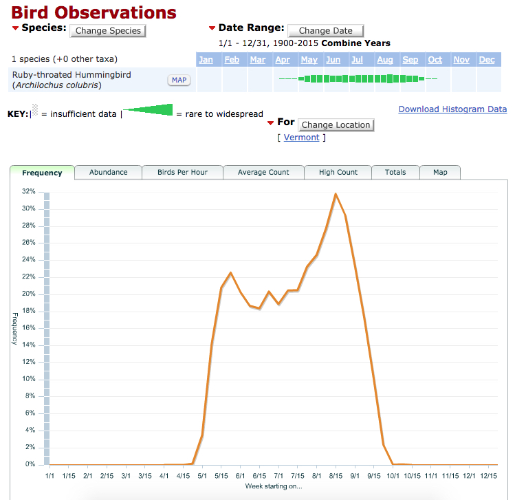
The frequency of Ruby-throated Hummingbirds reported on Vermont eBird checklists.